Cranking it Out Old School Style: The Lost Legacy of Gestetner Art
Historical Essay
by Lincoln Cushing, First published in AIGA Voice 10/2010
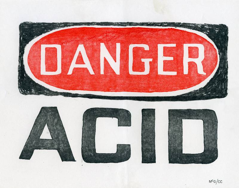
“Danger : Acid” by “McG”, 1967
Every society has its pecking order, and printing is no different. Equipment matters. At the top of the heap are the big presses – the giant Goss web machines that churn out daily newspapers, the high-speed Solna sheetfeds for beautiful color posters, the elegant Heidelberg Windmill letterpresses for art prints. At the bottom are the lowly duplicators, not even called presses, that are the Volkswagen bugs of the reproduction world. People of a certain age may remember the two offset workhorses of this stratum, the A.B. Dick 360 and the Multilith 1250. But even below these machines, at the very dark recesses of the reproduction food chain, lay the spirit duplicators and mimeographs.
Before photocopiers took over the short run end of copymaking, messy and relatively inexpensive machines called Dittos and Mimeographs and Gestetners ruled the earth. Virtually every school, office, and union hall had one in the back room, usually surrounded by reams of paper and the unmistakable odor of fresh solvent. There were two competing technologies. Both used prepared stencils on rotating drums, but while the “spirit” duplicators (like the Ditto) relied on a very aromatic methyl alcohol to create the image on paper, the other processes used ink. And although the stencils were originally produced with a pen or typewriter, by the mid 1960s stencil-burning machines pioneered low-cost scanning of original art – both flat and full-color were possible.
This, coupled with the fact that by swapping or cleaning the ink drums one could print multiple colors in subsequent passes, offered some of the earliest opportunities for community-based artists and organizers to make colorful flyers and newsletters. It may be hard to believe in this day and age, when “color separation” isn't even a conscious act and photographs can be effortlessly published on a Web page, but this quaint technology was a breakthrough aesthetic boon to democratic media. They could also make copies on“legal size”paper (8 1/2 x 14") that was often folded in half for magazine work.
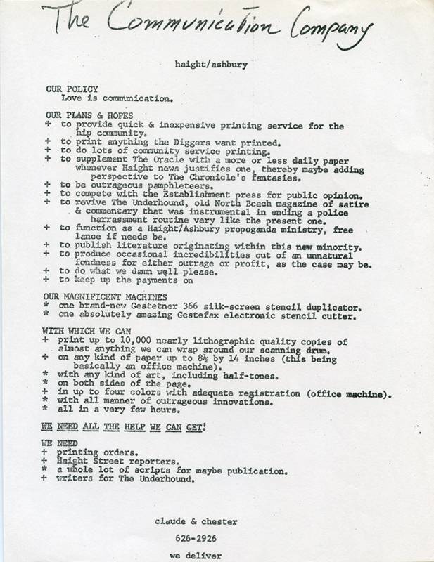
Promotional flyer for The Communication Company, 1967
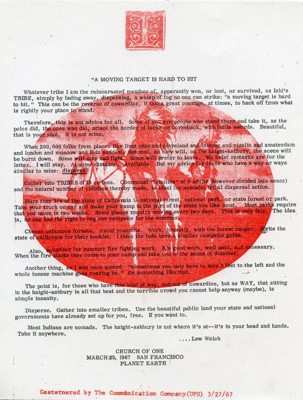
Among the first to experiment with the artistic possibilities of these machines was the Communication Company (“CC”), founded in San Francisco's Haight-Ashbury district by Chester Anderson and Claude Hayward in January of 1967. This was the epicenter of the new counterculture, and every movement needs a medium. Hayward describes how it started:
Around December 1966 we met Chester Anderson, I don't exactly remember the date or in which context, but somehow or another he moved in with us at 406 Duboce Street [San Francisco] which became the first Communications Company location. Chester was the one who was aware of the Gestetner and came up with the idea of getting this machine. He had some money left over from royalties from his science fiction fantasy novel The Butterfly Kid, which had been published by Pyramid Books. He had a few hundred bucks and we went down to the Gestetner company and we managed to walk out of there with the Gestetner and the Gestefax scanner, based on his down payment and my signing for it because I was the one with a job [at Sunday Ramparts]. (phone interview with author 10/1/2010.)
The Communication Company cranked out an endless stream of flyers and handbills for community groups such as the San Francisco Mime Troupe and the Diggers as well as scores of events. As their promotional flyer stated, they planned to “Provide quick & inexpensive printing services for the hip community.” They also aspired to “Produce occasional incredibilities out of an unnatural fondness for either outrage or profit, as the case may be” and to “Do what we damn well please.”
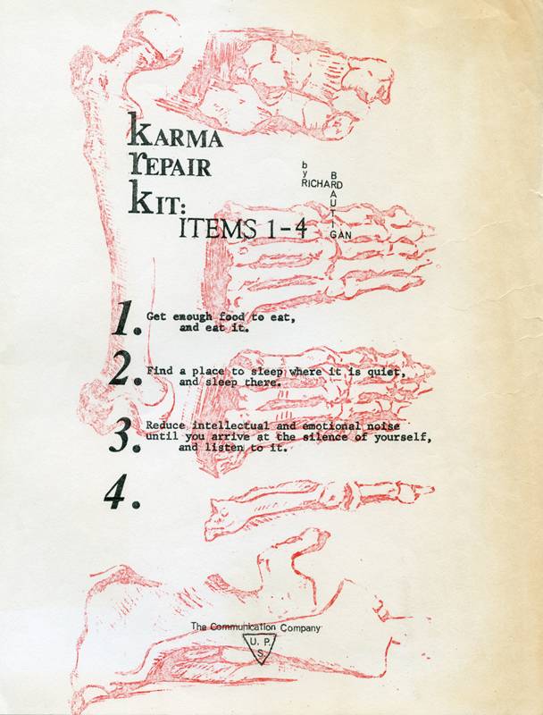
“Karma Repair Kit: Items 1-4,” poem by Richard Brautigan, 1967
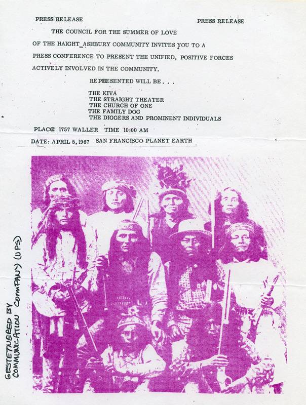
"Press release : The Council for the Summer of Love,” 1967
Their state-of-the-art equipment consisted of a brand-new Gestetner 366 silk-screen stencil duplicator and “one absolutely amazing Gestefax electronic stencil cutter.” Many of their works were proudly labeled “Gestetnered by Communication Company.” According to Hayward, the artistic force behind the experimental graphic work was William “Billy” Jahrmarkt, who joined up with CC just about the time that Hayward was getting pushed out over personality clashes with Anderson. Hayward explains the exploration of color and graphics:
I had some prior printing experience—I'd done some pasteup with the L.A. Free Press and I had worked on a letterpress with cold type. I understood the concepts of registration and color separation, but of course that was higher end work than we were doing at the time. I was always the “hands on” guy, I don't know if Chester ever ran that machine. I started playing around with the possibilities, and the first color stuff we did was with several stencils overprinted with simple color. I wasn't approaching this from an artistic standpoint so much as I was being pragmatic, “Let's get this work done.” As people asked for certain things we tried to see what we could do. I wasn't an artist.
Up until around June or so we didn't make any leaps into new territory. The person who really opened the door to using color was William Jahrmarkt, known locally as “Billy Batman.” I think he had a big art reputation in NYC before S.F., but I am inferring that from what I heard at the time. He was the father of “Digger Batman,” of whom Kirby Doyle wrote about in the poem "The Birth of Digger Batman.” Jahrmarkt was your classic brilliant crazy scion of a wealthy family. There was lots of money, so he got to indulge himself in his art and his heroin. He did some amazing work. He started really, really pushing the limits—bleeds, color changes, streaks, and more.
The ink came in tubes. We just cleaned it out to change color. It didn't use a drum. There were two cylinders with a silkscreen belt running on them. I guess we changed those. Ideally, each ink color would have its own screen. The stencil was thin rubber backed with paper and it was critical to get this on right while peeling the paper backing away. It also accepted the standard paper mimeo stencil, and we used these on some of the text stuff we did ourselves. When someone brought in "camera-ready" copy, it went through the Gestefax. The Gestetner was a very well designed machine, very tidy to operate. It never gave us any trouble at all. We just had to keep it clean. The Gestefax was flawless. It was the first scanner, pre-digital technology. It actually produced a stencil by burning a hole with an electric spark. So we played with that, a lot. The Gestefax scanner derived, I believe, from early facsimile transmission devices, before what we now call "fax".
“A moving target is hard to hit,” by Lew Welch, 3/27/1967
The Communication Company lasted less than a year, after internal struggles blew it apart.
[By August of 1967] Chester had gotten pretty crazy and I'd lost access to the machinery. He'd always done a lot of speed, he was a heavy user. There was a point that he shanghaied the machines and ran off with them. He had some place in Richmond or Alameda, and I remember going out there to talk to him and he took a shot at us out his window. We left. The Digger folks themselves basically ended up seizing the machines from Chester. I'm not sure when Batman got his hands on them, but it was after his child was born that I got to know him. There was probably a good year of really interesting stuff that came out after I was gone.
These CC examples were provided by countercultural collector and historian Richard Synchef, gathered from the late San Francisco writer Margo Patterson Doss. Doss had contributed a sum of money to support the printing of a Richard Brautigan's poem "All Watched Over by Machines of Loving Grace" both as a broadsheet and later as a one-off booklet, and in return she received a copy of each handbill they printed.
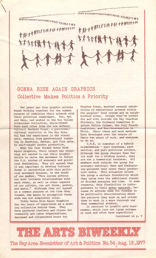
The Arts Biweekly: The Bay Area Newsletter of Art & Politics, issue #54, August 1977; published by Intersection. Produced by the San Francisco Art Workers Coalition.
By the mid 1970s, another Gestetner movement had gained momentum in the Bay Area. A critical mass of neighborhood arts organizations and community-based artists were prolifically making murals, posters, theater, and other cultural forms. Once again, the lowly Gestetner came to the rescue in helping spread the word, and in some cases, be the word. Intersection, still alive and now called Intersection for the Arts, published a wonderful biweekly with essays, reviews, news – and art.
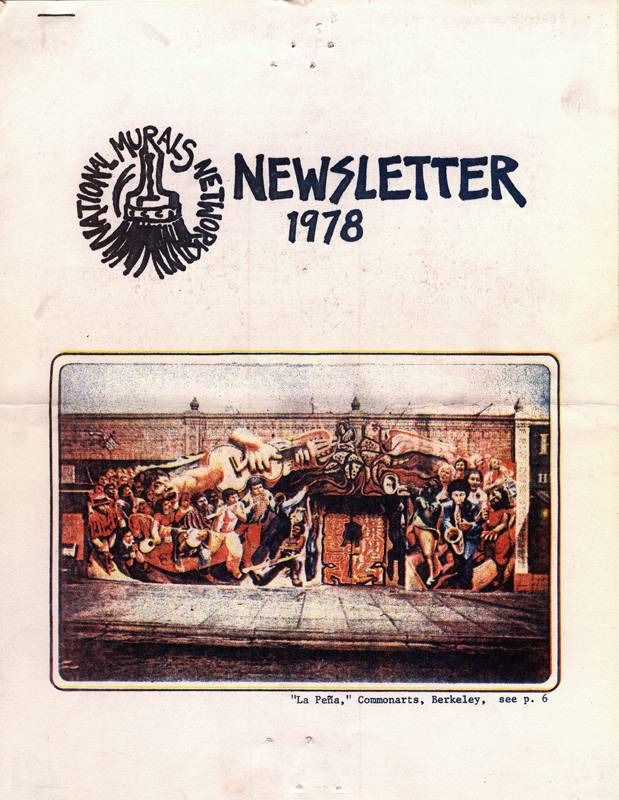
And the new National Murals Network published their first newsletter (later to become the Community Murals Newsletter), featuring the exciting new entry for Berkeley's La Peña Cultural Center.
Artist/printer Jane Norling describes what it was like:
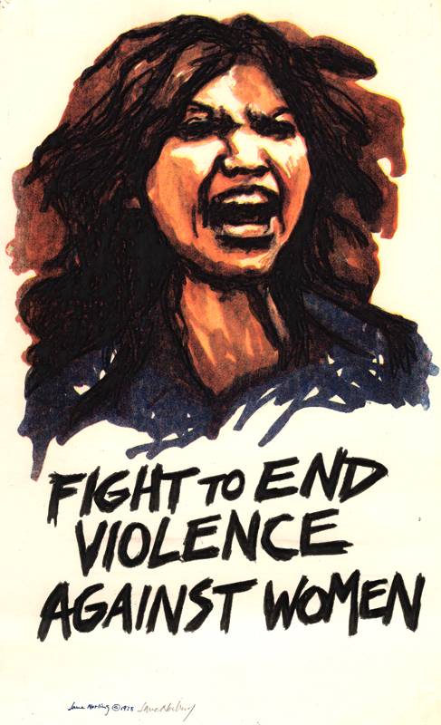
The greatest challenge was creating a design and printing 500 copies in a day in context of other such work. The Gestetner process allowed us to create artwork with pencil and marking pens directly on letter or legal-size paper, affixing strips of type, gluing paper with typewriter text to layout, placing on scanning drum and etching stencils. The challenge was to produce clean copy to prevent spending inordinate time masking out areas on stencil etched by shadows from pasted paper, dust, etc. Limitation: scans from photography produced murky color prints. My workaround was to trim photos in erratic shapes to catch the eye, so content of images was of less of a concern. Scans were ersatz CMYK, exact registration in printing impossible. The technology was the message - a certain inkjet quality of fluid ink on matte paper, ill-defined edges, but that's what it was. We were thrilled to have capacity to turn around color work so rapidly. (e-mail correspondence with author 9/11/2010)
Here are some examples of the work done on these unsung heroes of the printing world. The artists and press operators deserve credit too—this was a painstaking and imperfect technology.
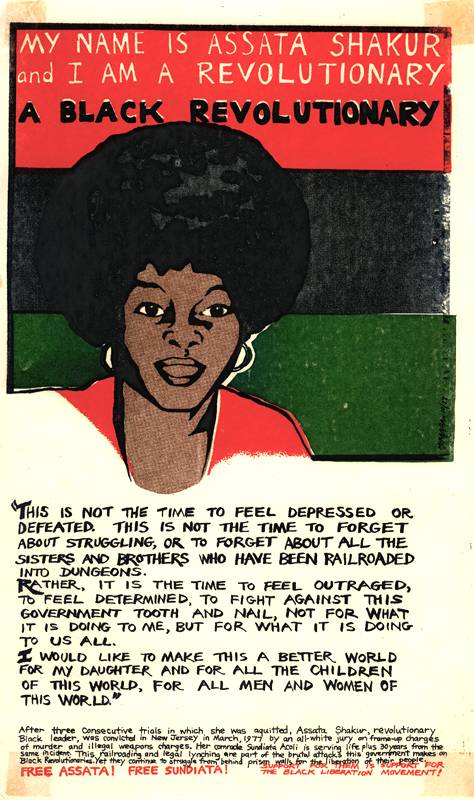
“My name is Assata Shakur and I am a Black revolutionary” by Miranda Bergman, 1977 (printed by Jane Norling).
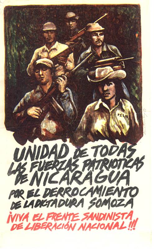
[For the unification of all the Nicaraguan patriotic forces in toppling the Somoza dictatorship : Long live the Sandinista Liberation Front for National Liberation!]” art and printing by Jane Norling, 1978
“Fight to end violence against women” art and printing by Jane Norling, 1978
Cover for National Murals Network newsletter, 1978. Color separation of mural at La Peña Cultural Center, Berkeley, CA.
Credits: Communications Company flyers courtesy Richard Synchef, 1977-1978 flyers courtesy Jane Norling. National Murals Network Newsletter courtesy Timothy Drescher. Arts Biweekly from author's collection. Scans by author.
Background links and further reading:
Red in black and white: The New Left printing renaissance of the 1960s – and beyond
Directory of San Francisco Bay Area political poster workshops, print shops, and distributors
http://en.wikipedia.org/wiki/Duplicating_machines http://en.wikipedia.org/wiki/Mimeograph http://www.arthurmag.com/2009/08/04/the-diggers-papers-14-the-invisible-circus/ http://www.brautigan.net/who.html

